How could I have passed this up?
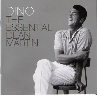
Other artists usually have serious cover shots for a hits album, or splashy graphics and fancy packaging. Not Dino. All Dino needs is a casual picture (probably staged, but still catching him at ease) on a clean silver background. Add his name, and there you go. Of course I bought it. Thirty songs, smooth and creamy, bite-sized nuggets of perfect cool.

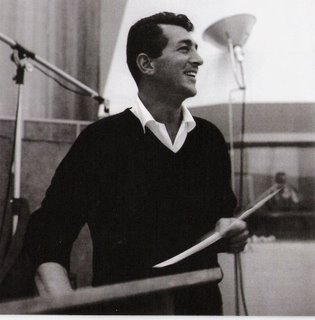
This shot is from the interior, and it's Dean all over. Someone off-camera probably cracked a joke. I like to think, instead, that it's the exact moment that his daughter Deana mentions in the liner notes - "He saw Mom and I and, before he gave the signal to start the session, he stepped from the riser and gave each of us a kiss and a hug."
Both her and her sister Gina give great remembrances of Dean. Steve Van Zandt somehow gets into these liner notes too, and gives us this: "He would always be a part of my personality, just as the Rolling Stones would be. I would combine the two in the E Street Band playing Dino to Bruce Springsteen's Sinatra. And this is what David Chase would pick up on when he cast me in the Sopranos twenty years later."
OK, so, Steve? All those shots of you in the bandana crouching next to Bruce like a puppy while he's trying to play? Not cool like Dino. The Sopranos? Totally not about your "resemblance" to Dino. These liner notes? NOT ABOUT YOU AT ALL, YOU WANKER.
Luckily, all his self-delusion is on one convenient page, back-to-back, and easily removable with a pair of scissors without losing a single picture of Dino or a word of his daughters' memories. I think I owe it to Dino to trim it away. Steve's liner notes NEVER HAPPENED. On with the music.
No comments:
Post a Comment